
Feeling lost in the world of data science? No worries, this blog post has your back!
We’ve got 20 creative infographics that simplify key data science concepts. From comparing machine learning to infant brain development to visualizing bias-variance trade-off with mice weights, we’ve got it all covered.
Decipher “in-sample” vs. “out-of-sample” data, master hypothesis testing and chi-square tests, and more.
Get ready to dive into infographics that will transform your data from raw numbers to powerful insights!
1. Unveiling the Data Science Life Cycle: A Visual Safari
Curious about how data turns into valuable insights? Let us paint you a picture!
Our next infographic is like going on a thrilling safari through the data science life cycle. Picture this: raw data evolving into a predictive gold mine, each step unfolding like a chapter in an exciting story.
From data cleaning to machine learning models and real-world applications, it’s all laid out for you in this insightful infographic.
Let's plunge into the following topics together to break down model evaluation metrics in Machine Learning

 |
|---|
2. Machine Learning (ML) Demystified
Ready to uncover the mystery of machine learning?
Our next infographic is like lifting the veil on machine learning magic. Get ready to explore how machines learn from data, predict the future, and work wonders — from Netflix recommendations to spam filtering.

3. Bias Variance Trade-Off: A Balancing Act
Balancing machine learning models is as tricky as finding the perfect weight-to-height ratio for mice!
In our next infographic, we dive into the concept of bias-variance trade-off using this clever analogy.
Imagine your model as a mouse: Is it consistently predicting the same height for every mouse, or is it drowning in noise?
Learn how to strike the perfect balance for precise predictions — our infographic holds all the secrets!

4. Navigating In-Sample vs. Out-of-Sample Data
Feeling lost between in-sample and out-of-sample data?
Think of it like studying for a test versus applying your knowledge in the real world. While training data is like your class material, true learning happens when you apply that knowledge to unseen situations.
Our next infographic delves into how out-of-sample data shapes robust models that tackle real-world challenges.

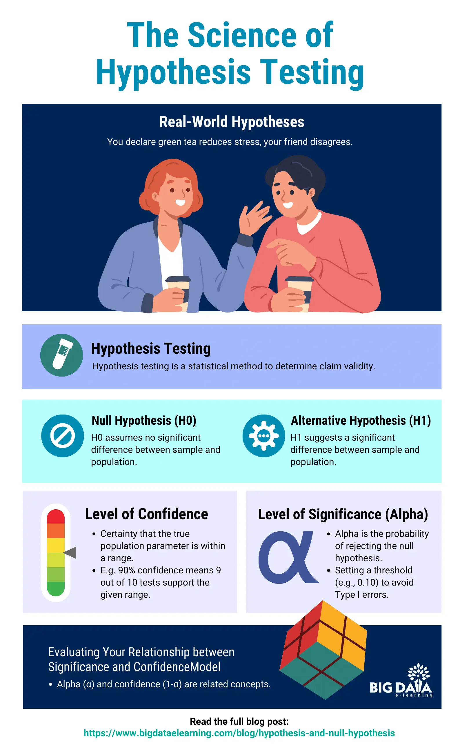
5. The Science of Hypothesis Testing
Ever wondered how science proves theories?
Picture yourself as a detective investigating two suspects: “no difference” and “a significant difference”
Our next infographic dives into this detective work of hypothesis testing. Get ready to uncover the secrets behind drawing scientific conclusions — it’s all revealed in the infographic!
|
|---|
6. Chi-Square Test: Accept or Reject Null Hypothesis
Confused about the chi-square test?
Imagine it’s like solving a mystery by comparing “expected” and “observed” data. Our next infographic breaks it down into three simple steps, guiding you to uncover the truth behind your data and make informed decisions.
Ready to unravel the secrets of the chi-square test?

7. Train-Test Split
Curious about how machine learning models avoid memorization overload?
Imagine it’s like teaching students in a classroom: You train them with material, then test them with unforeseen questions — just like a pop quiz!
Our next infographic uses this analogy to explain the train-test split.

8. Understanding the Confusion Matrix
Feeling unsure about your machine learning model’s performance?
Picture a table showing hits and misses, with terms like “true positives” and “false positives.” Our next infographic unlocks the mystery of the confusion matrix.
Learn how to use it to pinpoint your model’s strengths and weaknesses for better evaluation.

9. Understanding Normalization and Standardization in Data
Ever feel like your data is chaotic?
Imagine it’s like comparing the number of bedrooms to million-dollar mansions — not ideal for machine learning, because the number of bedrooms can be a single digit number, whereas the prices of homes could be in millions.
Our next infographic uses a house price vs number-of-bedrooms analogy to demystify normalization and standardization.
Learn how these techniques transform your data into a neat and friendly format for better analysis.


10. The Art of Probability Distributions
Struggling with probability distributions?
Picture rolling a six-sided die — how likely are you to roll a specific number? That’s the essence of probability distributions!
Our infographic simplifies this concept using the die-rolling analogy.
Explore the likelihood of different outcomes, like picking the perfect watermelon or flipping heads or tails.

|
|---|
Stay connected with weekly strategy emails!
Join our mailing list & be the first to receive blogs like this to your inbox & much more.
Don't worry, your information will not be shared.


